Accessibility Options
The Mairangi Arts Centre is designed with accessibility in mind. Please see the accessibility options we have available at the centre. The centre has a silver rating from Be.Accessible.
If you think there is anything extra we could be doing for accessibility, please let us know by contacting our Centre Manager.
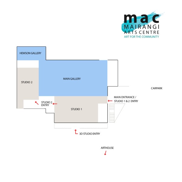
MAIRANGI ARTS CENTRE FACILITY MAP
ARRIVING & GETTING IN
BUS STOP
The bus stop is 300 metres from the Mairangi Arts Centre and is located at 370 Beach Road. Bus stop number is 3158 and covers routes from Browns Bay and Long Bay.
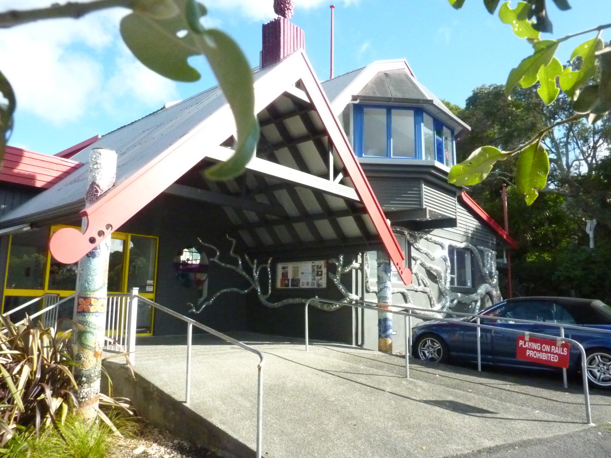
To get to the Arts Centre from the bus stop, head north on Beach Road and after about 30 metres turn left onto Hastings Road. The entrance of the Arts centre is on the left at number 20 Hastings Road.
The bus stop offers shelter and seating.
CAR PARKING
There is no drop off/pickup zone however there is one accessible car park which is located at the front of the building (within 200 metres of the main accessible entrance/exit) to the far right hand side. Those using the accessible car park will need to pass behind parked cars to get to the entrance.
ACCESSIBLE ROUTE INTO THE CENTRE
The most accessible route is a concrete pathway sloping up to the entrance of the building from the car park. The width of this pathway is less than 1200mm and it does not have tactile indicators installed.
The main centre entrance has a wide concrete sloped pathway up to the door. The entrance doors are automated double glass doors, which activate from a shallow approach. These stay open longer than 5 seconds. The doors have bright yellow framing with a yellow panel that runs through the middle of the door and acts as a clear visible marking.
All support animals are welcome on premises (e.g. guides, hearing or mobility dogs, etc.).
GETTING AROUND WITHIN THE SITE
CUSTOMER SERVICE
Our staff are friendly and are happy to assist with access to the centre. The reception counter is located round the corner to the right after entering the building.
Mairangi Arts Centre have a large range of accessibility customers that attend workshops and exhibitions and you’re sure to feel at home. Guided tours can be booked if required.
USING THE CENTRE
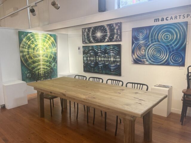
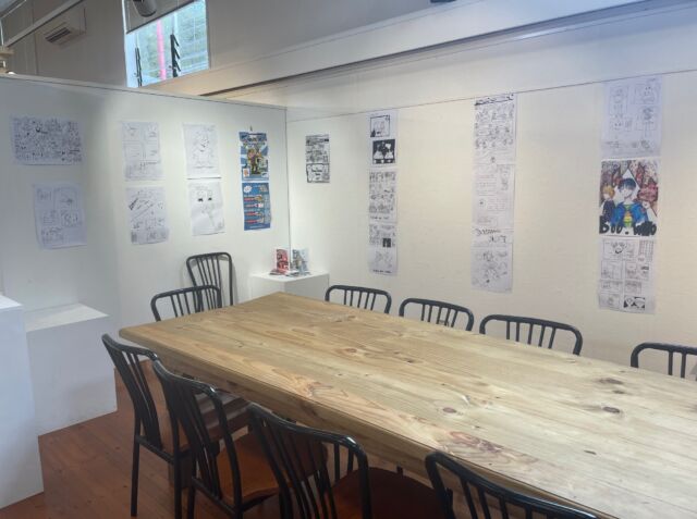
All support animals are welcome on premises (e.g. guide, hearing or mobility dogs, etc.).The Mairangi Arts Centre consists of a large exhibition gallery, a smaller gallery, members’ exhibition space (MAC Artspace) and four workshop studios. The galleries are very spacious and do not have any foreseeable hazards.
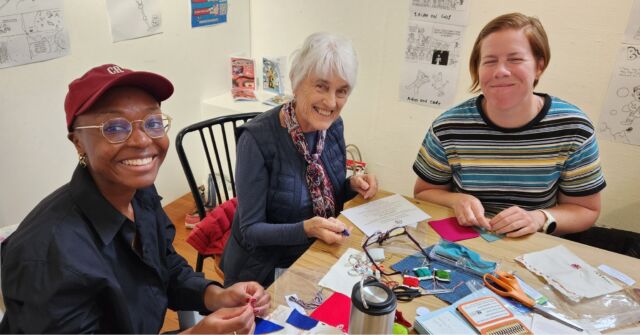
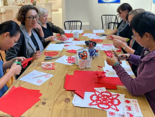
The studios spaces are a great place for accessibility customers to fully participate in workshops and classes. All contain movable furniture and the workable height for each table is 755mm.
There is a kitchen within the main gallery with a large communal table & chairs where breaks are taken during workshops. The kitchen is spacious and wide, however not all facilities are within the reachable range of 900 – 1200 mm.
There is direct access to an accessible toilet.


